Our #1 PRO Tutorial ever is now on Sale! https://phlearn.com/popular
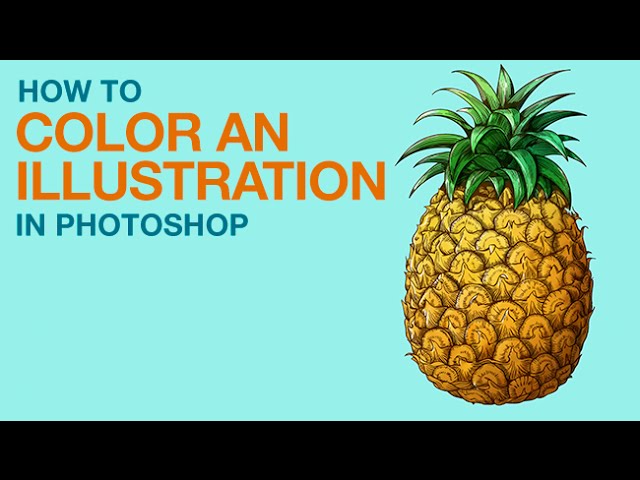
How to Color an Illustration in Photoshop
Anyone can be an illustrator in Photoshop! Learn How to Color an Illustration in Photoshop in today’s episode.
Start by downloading an image from a stock website like Fotolia, or scanning in your very own work! If you want to follow along with this episode, click HERE to purchase Fotolia’s pineapple: https://us.fotolia.com/id/62812427
Coloring in the lines
Let’s travel back in time to coloring books and crayons….be sure to color in those lines! To make this job much easier, use a selection tool to select just the background of the illustration (this will depend on what type of image you have. If it makes more sense, feel free to select the illustration itself instead). Then, turn the selection into a layer mask. You will need to invert the mask (Cmd/Ctrl + I) if you selected the background originally. That mask will be applied to a group that holds all of your layers.
Now, when you paint on top of the image, you will only be able to color inside of the lines. Yay.
Time to have some fun! Select whatever color you want to start with and have at it! Your mask will restrict you to staying within the lines, but that can always be turned off. It’s also helpful to put each color you paint with on a different layer, so that you can go back in and edit them individually.
Highlight & Shade
Art tip #1: Figure out where the light source is! We decided that on the pineapple, the light/sun will be coming from the upper left corner. This means that the parts closest to that angle will be the brightest and have highlights. It also means that shadow would fall on the opposite side of the fruit. Highlights and shadows will help to make your illustration look much more realistic.
We recommend using the color palette to use a darker version of your illustration colors for the shading, and a lighter version for the highlights. Using a dark color is much better than just using a grey or black.
Don’t Forget the Details
To add some really nice and subtle detail, we paint some reds and yellows over top of the pineapple and change the blending mode to Soft Light (this is on a new layer). We do the same in the leaves of the fruit, and it makes the illustration much more interesting and dynamic!
Although we already painted in some general highlights and shadows, some tiny little strokes will add a nice effect too. We create a new layer and draw some tiny white highlights on the tops of the leaves and the round parts of the pineapple bumps. The same is done for the shadows, by adding some dark strokes underneath the leaves and on the underside of the pineapple bumps.
That’s all there is to it! You can really have some fun with this technique, so don’t be afraid to experiment with crazy colors and drawings!
———————————————————————————————-
VISIT PHLEARN.COM FOR MORE FREE TUTORIALS
SUBSCRIBE TO OUR CHANNEL FOR MORE FREE TIPS AND TRICKS
http://www.youtube.com/subscription_center?add_user=phlearnllc
GET FREE TUTORIALS IN YOUR EMAIL + DISCOUNTS ON OUR PRO TUTORIALS!
https://phlearn.com/mail
BUY THE TABLET AARON USES! https://phlearn.com/tablet
LET’S BE FRIENDS!
Instagram ► https://www.instagram.com/phlearn/
Facebook ► https://facebook.com/phlearn
Twitter ► https://twitter.com/phlearn
Google+ ► https://plus.google.com/116791098059215639405
Phlearn ► https://phlearn.com
———————————————————————————————-
Stock Images provided by: http://us.fotolia.com/