Our #1 PRO Tutorial ever is now on Sale! https://phlearn.com/rtyoutube
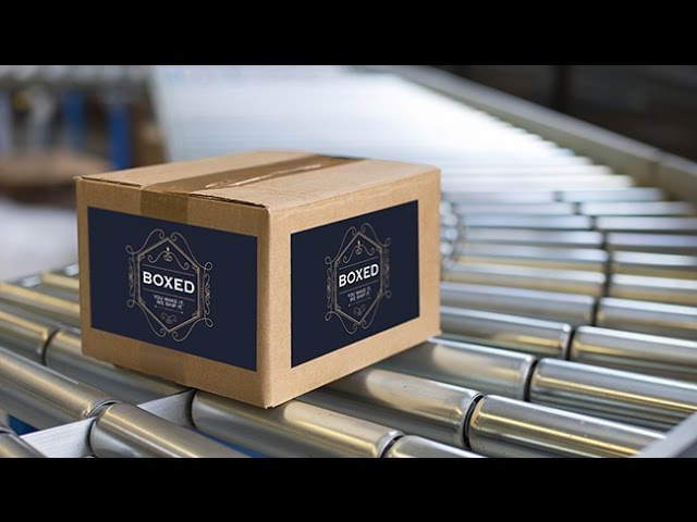
Have you ever wanted to create a mockup of how your graphic design will look on the package it’s destined to be printed on?
Throughout any designer’s life, either for yourself or for a client, you will work on a graphic that needs to be printed out and applied to a physical object.
The hardest aspects of adding text, logos, or graphics to any surface inside a photo is getting the perspective, color, and texture correct. Aaron will guide you through a step-by-step process for making this tedious design task, both easy and phun.
Copy the Logo Onto Your Clipboard
Use Move Tool (V) to drag Logo onto Box document. Transform (CTRL/CMD + T) to make logo smaller, and fit box. Next, copy logo onto clipboard by holding CTRL/CMD and clicking on logo thumbnail to select it, then hitting CTRL/CMD + C to copy the selection to the clipboard.
Make Logo layer invisible and deselect (CTRL/CMD + D). Create a new layer, and on it go to ‘Filter – Vanishing Point’.
Create Perspective Plane
In the Vanishing Point Filter, click on the Create Plane Tool and place a point at each of the four corners of the box. The filter will automatically connect these dots into a perspective grid. Get it as accurate as possible, but don’t worry if it needs fixing – you can edit your points at any time.
Place Logo in Filter
Hit CTRL/CMD + V to paste the Logo (from your clipboard) into the filter. Transform the image (CTRL/CMD + T) to make it the right size for the box. Then, just click and drag it onto the plane, and it will automatically transform into perspective.
To create another plane next to the first one, choose the Create Plane Tool. Click on a side of the first grid, hold CTRL/CMD, and drag out to the end of the box to create your second plane.
Follow the same steps to paste and drag your logo onto this second plane, and it will transform into perspective as well.
Blur the Logo for a More Realistic Look
As a bonus, we cover how to blur the logo so it matches the perspective blur of your photo. Right click on your logo layer and click ‘Convert to Smart Object’, allowing you to use a smart filter.
After the conversion, go to ‘Filter – Blur Gallery – Tilt Shift’, and adjust the settings to make your logos look like they’re blurring into the distance. Since it’s a smart filter, you can go back and change your blur at any time.
And that’s it for creating a packaging design mock-up in Photoshop! It’s a simple way to show your design work in action.
VISIT PHLEARN.COM FOR MORE FREE TUTORIALS
SUBSCRIBE TO OUR CHANNEL FOR MORE FREE TIPS AND TRICKS
http://www.youtube.com/subscription_center?add_user=phlearnllc
GET FREE TUTORIALS IN YOUR EMAIL + DISCOUNTS ON OUR PRO TUTORIALS!
https://phlearn.com/mail
BUY THE TABLET AARON USES! https://phlearn.com/tablet
LET’S BE FRIENDS!
Instagram ► https://www.instagram.com/phlearn/
Facebook ► https://facebook.com/phlearn
Twitter ► https://twitter.com/phlearn
Google+ ► https://plus.google.com/116791098059215639405
Phlearn ► https://phlearn.com