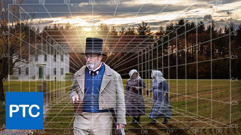
Photoshop CC tutorial dealing with what is perhaps the most import thing when it comes to compositing images together; perspective.
The techniques that I’m going to teach you in this video, will make you a much better Photoshop user. They will make your compositions look much more realistic, and you’ll know what types of images you’ll need to complete a great composite.
Today’s, compositions comes from Facebook Photoshop and Lightroom group admin, Karen Burke, who was nice enough to lend us her images for this tutorial.
We’re going to take Karen’s composition, and see how we can fix the perspective, so that the subjects don’t look like their floating over the field. There’s other issues with the image such as lighting, but we will only focus on perspective in this video.
You can get pretty much get everything else right, lighting, color, shadows, and extractions, but if the perspective is off, your viewer will know something is not right. They might not know exactly what it is, but they’ll know there’s something wrong with the image.
Don’t feel too bad if you’re making these perspective mistakes, I’ve seen movie posters, and advertisements that are just horrible, when it comes to perspective. So even some pros have problems with putting together multiple images from different sources.
If you have any questions please leave them below
or head over to this tutorial’s page on our website:
The Secret To Creating Amazing Composites: Perspective And Vanishing Points
Subscribe + Like + Share + Comment = More Video Tutorials!
Thank you for watching!
===================================
LINKS
Website:
http://photoshoptrainingchannel.com
Facebook:
https://www.facebook.com/PhotoshopTrainingChannel
Google +:
https://plus.google.com/117602978180599831857
Pinterest:
http://pinterest.com/ptcpins
YouTube Channel:
https://www.youtube.com/user/photoshoptrainingch
This Video’s Youtube Link:
RSS Feed:
http://feeds.feedburner.com/PhotoshopTrainingChannel